

May 19, 2024
Written by
Becca Levian

When I was younger and hadn't yet secured a full time agency role, a Creative Director at an agency I was applying to gave me advice. He said, "Even if your portfolio isn't where you want it to be, you can design conceptual designs for brands you love to show your capabilities."
I thought this advice and concept was game-changing. Since then, I've loved designing mockups like this to show my interpretation of a brand. This one is no different, though because it was only going on social (and not my portfolio, trying to land myself a job), I only spent about 3 hours on this. However, for what it's worth, I still think it represents Sara well.
Since I started posting these conceptual reels to Instagram, I realized that there's so much more I want to share about each brand than I have room or time to say in a short reel. Therefore, I'll use these blogs as a space to dive deeper.
With that said - I'm going to break the whole process down for you. Keep in mind, all in all it was only about 3 hours of work, whereas when we work with a client, by the time we get to the Homepage design of their website, we've already spent countless hours on branding, strategy, design foundations and thinking around their brand. However, the whole idea with the Conceptual Homepage series is that they're my quick attempt at designing the homepage for a personal brand we all know and love.

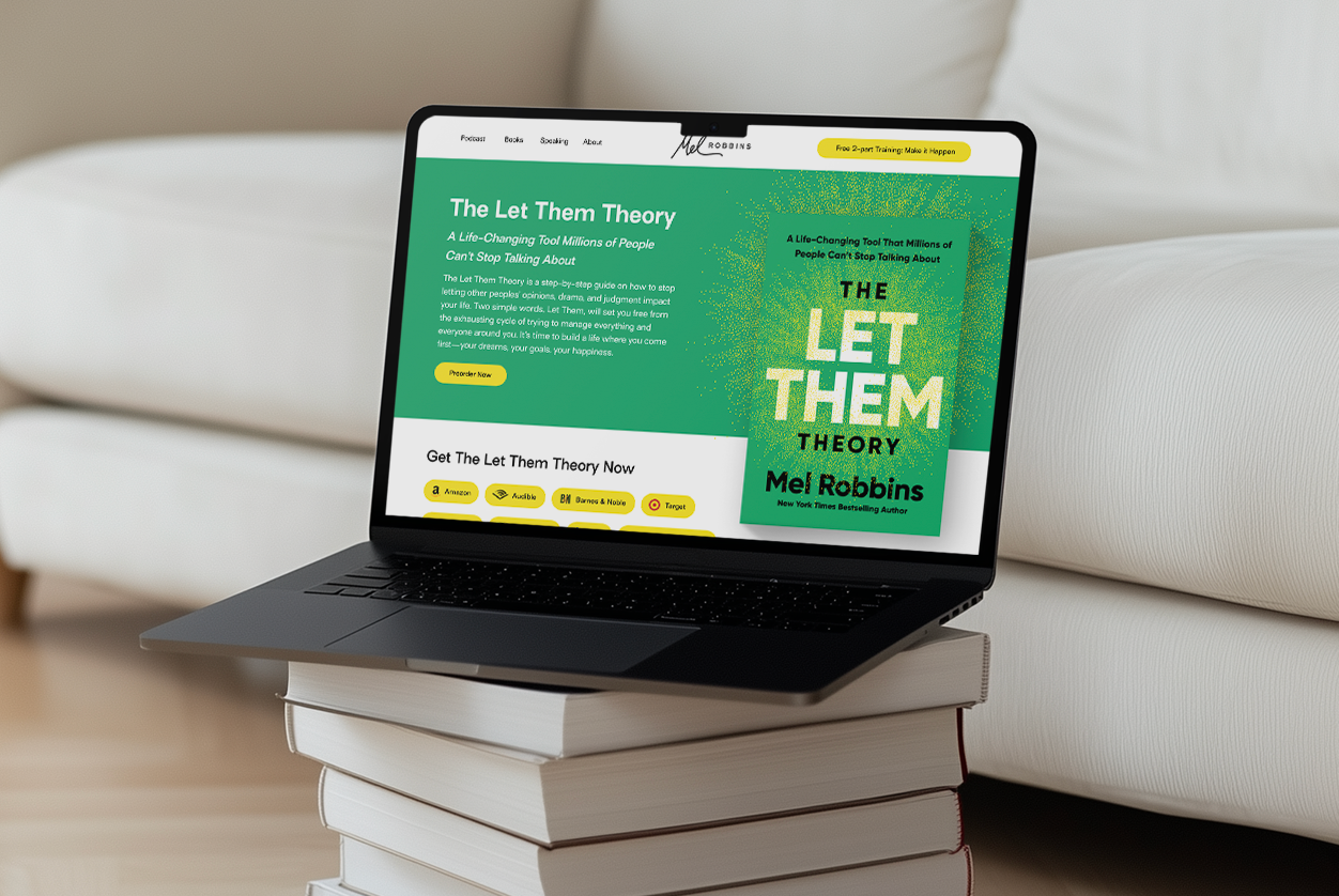
Before jumping in the design, I always start by researching the person. I pulled images I felt represent Sara well. I've followed her on Instagram for years, so even though I don't know her personally, you get the sense that she's spunky, bold, and not afraid of putting herself out there. I wanted this homepage to reflect that.
This research brought me to create a really simple yet bold color palette consisting of a black, neon chartreuse (inspired by her shirt in the photo above), a light pink and neutral beige. I also started playing with font exploration, finding fonts that felt both confident and commanding but also sleek and feminine. She doesn't have a personal brand website (WHY, SARA, WHY!?) so I wanted to think a bit more strategically about what WOULD be on her website if she had one.

Before designing any conceptual homepage, I spend some time thinking about what sections are needed to tell their story. I think of a homepage as a cliff notes to their entire brand, or in this case, their businesses and entire ecosystem. Therefore, I wanted to make sure all of Sara's latest projects and press would be included.
The way I thought about Sara's homepage is:

Once I knew the sections I wanted to include, it was time to get into design. When I'm designing any Homepage, I think about 3 things the most:
While we want a strong and ownable design, the key is not overdoing it. We want to create a page (and typically an entire website) that feels cohesive and brand aligned with every section. The colors should be used in a way strike the right balance and tone that you want to create (depending on what the brand is). For instance, I wanted to use the chartreuse more sparingly so it wouldn't feel overwhelming or make the text hard to read. A color like this is great for buttons though because it immediately draws your eyes to them (which is what we want!)
To see the original post, click here

We'd love to work with you. Contact us today to get started.

Get the most kick-ass emails that will skyrocket your business!
Lorem ipsum dolor sit amet, consectetur adipiscing elit. Suspendisse varius enim in eros elementum tristique. Duis cursus, mi quis viverra ornare, eros dolor interdum nulla, ut commodo diam libero vitae erat. Aenean faucibus nibh et justo cursus id rutrum lorem imperdiet. Nunc ut sem vitae risus tristique posuere.